
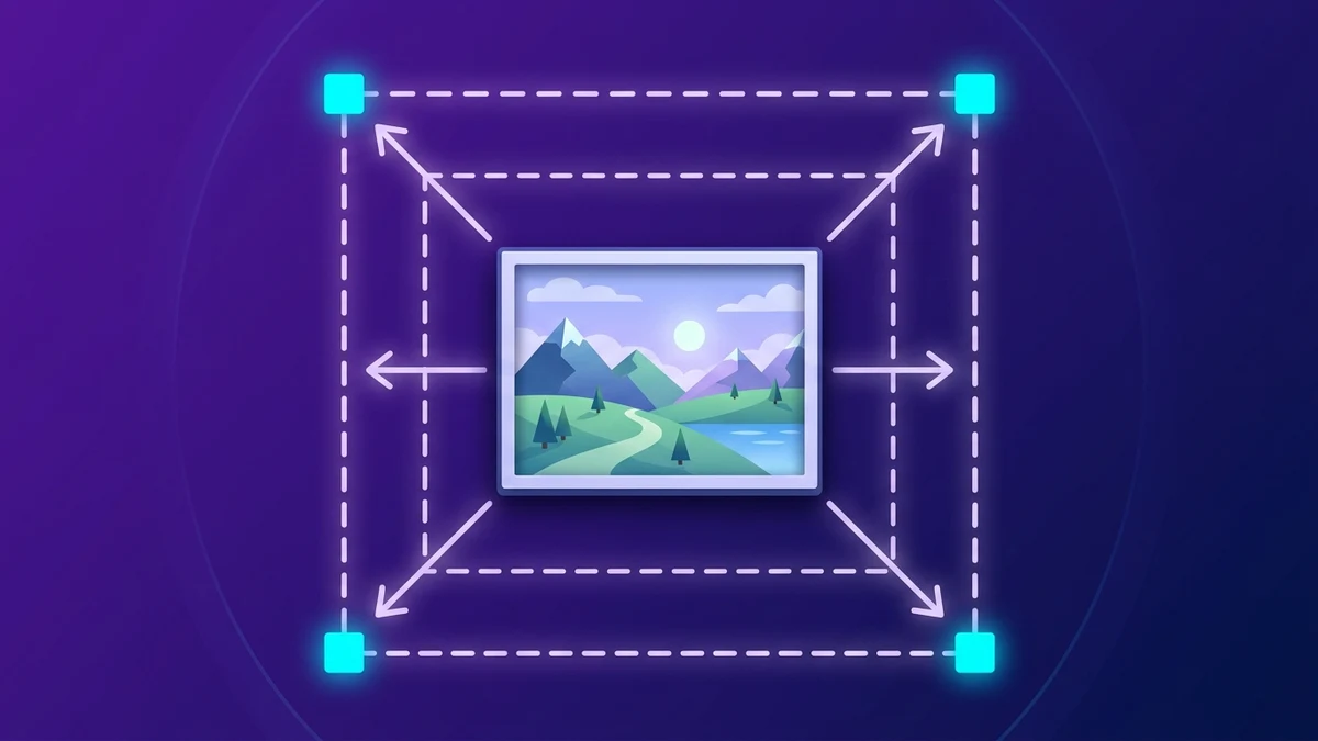
Changing an image's dimensions looks deceptively simple—type two numbers, hit save, and upload. Yet messy resizing ruins more websites, ecommerce listings, and formal job applications than almost any other file mistake. Faces appear unnaturally tall or compressed sideways; crystal-clear vector graphics turn soft overnight; tiny profile photos blown up into desktop hero slots dissolve into jagged stair-stepped blocks.
Learning how to resize image without losing quality comes down to respecting pixel direction (downscaling versus upscaling), preserving aspect ratios, knowing when to crop before scaling, and separating physical screen dimensions from confusing print DPI myths. Once these simple rules click, browser tools like Pixdoca let you turn raw 12-megapixel camera files into razor-sharp web banners, uniform store thumbnails, and exact portal portraits cleanly in seconds.
Downscaling vs Upscaling: The Fundamental Direction Rule
Inside every digital photo sits a fixed grid of colored squares called pixels. A crisp photograph snapped on a modern DSLR or smartphone typically measures around 4000 by 3000 pixels (twelve million total sample points). Understanding which direction you move on that ladder determines image sharpness:
Downscaling (4000px -> 1200px): Crisp and Safe
When shrinking a large photograph down to fit a website column or application portal, your browser's resampling engine holds plenty of real optical detail to sample from. Neighboring pixels blend smoothly onto clean smaller grids via high-quality browser scaling filters inside HTML5 Canvas. Result? Edges stay firm, text stays sharp, natural lighting transitions look effortless, and file size plummets cleanly before compression even begins.
Upscaling (300px -> 1600px): Soft and Risky
Flip the direction—trying to stretch a 300-pixel thumbnail dragged off an email signature up to cover a 1600-pixel landing page hero—and no mathematical scaling filter possesses missing information about eyelashes, brick mortar, or serif lettering that was never captured. Standard resampling averages adjacent dots across gaps, yielding mushy blur or boxy pixel squares. Always capture or retrieve your largest unedited master copy first before resizing downward.
Aspect Ratio Lock vs Intentional Cropping
Nothing screams amateur design louder than squished faces or stretched round brand icons. Suppose you hold a rectangular landscape photo measuring 1600 x 1200 (a 4:3 aspect ratio) and a marketplace template demands a 800 x 800 square (1:1 ratio).
If you uncheck Lock Aspect Ratio and brute-force 800 x 800, every circular coffee mug turns into a tall narrow oval and people inside the frame immediately look ten percent thinner and artificially elongated!
To resize image without losing quality and preserve true geometry when shapes change:
- Open Crop Image first, select the target shape (
1:1square,16:9banner,4:5portrait), and slide the crop window so your main subject stays properly framed inside clean edges. Now your file measures1200 x 1200. - Next open Resize Image with Lock Aspect Ratio enabled, enter
800for width, and height calculates automatically to800with zero distortion!
Following Crop shape -> Resize pixels guarantees natural geometry across every store grid, testimonial card, and slide deck.
What Pixel Dimensions Should You Choose for Real Destinations?
Instead of guessing random numbers when prepping graphics, rely on proven display benchmarks:
Websites, Blogs, and Landing Pages
- Full-Width Desktop Hero Banners: 1600px to 1920px wide. Wider exports deliver negligible screen clarity gains while inflating mobile page downloads dramatically.
- Standard Article & Tutorial Images: 1000px to 1200px wide. Given most readable web article columns cap around 600–760 CSS pixels, exporting at roughly 1200px renders razor-sharp Retina clarity across laptop and phone screens without heavy bandwidth overhead.
- Thumbnails & Author Avatars: 150px to 320px square. Never load a 2400px headshot into a tiny 48px circular comment icon!
- Social Link Previews (OpenGraph / X Cards): 1200 x 630 px (
1.91:1landscape ratio) keeps blog link shares neatly centered across messaging apps and feeds.
Ecommerce Catalogs and Marketplaces
- Main Product Galleries (Zoomable): 1200 x 1200 px (or 1500 x 1500 px) supplies smooth crispness for storefront hover magnifiers without hitting raw 20 MB camera weights.
- Standard Category Grid Cards: 600px to 800px wide. Consistent uniform dimensions prevent uneven row heights across collection pages.
Government Forms, Exam Applications, and Resumes
- Portrait Headshots: Follow portal pixel limits verbatim—commonly
200 x 230 px,300 x 300 px,413 x 531 px, or600 x 600 px. Always check whether strict byte caps (<= 50 KB) apply too, then finish in Compress Image. - CV / Email Signatures: Keep headshots cleanly around 250px–400px and horizontal logo strips around 240px–360px wide so outbound email threads feel snappy and never overwhelm mobile inboxes.
Clearing Up the Pixel vs DPI/PPI Print Myth
Few topics confuse beginners more than DPI (dots per inch) versus PPI (pixels per inch) metadata saved inside image headers. Here is the plain factual distinction:
- On screens, websites, social apps, and nearly all online forms: DPI metadata means nothing. A
1200 x 800photo flagged "72 DPI" displays identically—pixel for pixel—to a1200 x 800photo flagged "300 DPI". Screens map CSS pixels directly onto physical display pixel arrays regardless of header tags. - Only physical offset printing cares about total pixels divided by inches: Want to print a sharp 4 x 6 inch glossy photograph at crisp 300 PPI retail quality? Multiply
4 * 300 = 1200 pxby6 * 300 = 1800 px. Feeding your local photo counter a clean1200 x 1800image guarantees sharp physical ink drops, whereas trying to shrink a photo below 1200px before printing starves physical inches of pixel data.
Focus on absolute width and height in pixels whenever preparing digital deliverables; reserve inch-by-DPI multiplication strictly for physical paper brochures and framing labs.
Why Resizing Before Compressing Protects Image Clarity
Many users open an image compressor immediately on a huge 4500px smartphone capture, notice the slider struggling to hit 100 KB, and slam quality down to 15%—turning clear photography into blurry smudge.
Flip the pipeline cleanly and watch sharpness jump dramatically:
- Resize dimensions first inside Resize Image: Scaling
4500 x 3000down cleanly to1200 x 800trims raw pixel count from 13.5 million pixels to 960,000 pixels—eliminating 93 percent of raw data cleanly via sharp grid averaging! - Compress bytes second inside Compress Image: Starting with just 960,000 purposeful pixels lets comfortable 78–85% compression hit nimble 60 KB to 120 KB sizes effortlessly while hair strands, text signs, and leather texture stay vibrant and natural.
Need ultra-tight portal targets below 50 KB? Walk through exact dimension-plus-compression formulas inside our post on how to compress image under 50 kb.
Preserving Sharp Typography and Flat UI Graphics During Scaling
Scaling continuous-tone landscapes behaves forgivingly, yet screenshots containing fine user-interface text or tiny charts need slightly closer attention:
- Stick to crisp fractional ratios when possible: Halving a
2400pxRetina dashboard screenshot straight down to exact1200pxmaps neatly 2-to-1 cleanly onto smaller pixel columns; arbitrary odd targets like1147pxforce subtle half-pixel interpolation softness across single-pixel border lines. - Export resized sharp UI captures as PNG or WebP: Once resized down in Resize Image, avoid heavy low-quality JPG blur around delicate numerals; run flat UI visuals cleanly through Image Converter to lossless WebP or clean PNG instead. Read our full comparison of WebP vs PNG vs JPG to match every asset format effortlessly.
Resizing Photos for Multi-Page PDF Packets Without Bloated Megabytes
Preparing ten phone camera scans of architectural plans, receipts, or school projects into one sharable PDF? Leaving ten raw 4032x3024 photographs uncompressed before converting turns a tiny report into a clunky 35 MB file email providers bounce immediately.
Instead, resize every document sheet cleanly down to 1200px–1600px on the longest edge inside Resize Image first (plenty for sharp crisp reading across laptops and standard letter printing!), convert if needed, assemble seamlessly with JPG to PDF, and tighten any leftover fat through Compress PDF. Your recipients still read every handwritten pencil margin effortlessly—inside a tidy 1.4 MB attachment!
Three Quick Sanity Checks Before Clicking Download
Before replacing existing media libraries or uploading resized deliverables cleanly from your browser:
- Zoom to 100% actual size: Always evaluate resized quality at true 1:1 native display magnification rather than zoomed 300% or squeezed tiny on a side panel.
- Check proportion fairness: Confirm circular coins, car wheels, logos, and faces maintain true horizontal-to-vertical ratios without sneaky horizontal stretching.
- Never overwrite your full-resolution original: Save clean resized versions alongside clear suffixes like
-1200w.webpor-thumb-400px.jpgwhile keeping untouched masters cleanly organized elsewhere.
Exact Dimension Reference Sheet Across Websites, Email, and Social Feeds
Stop hunting fragmented blog posts every time marketing asks for export targets. Use these tested starting dimensions inside Resize Image after framing proportions in Crop Image:
- YouTube Video Thumbnails & Course Previews:
1280 x 720 px(16:9) delivers crisp clarity across TVs, desktop browsers, and mobile feeds while keeping payloads compact beneath typical 2 MB creator upload ceilings. - LinkedIn, X (Twitter), and OpenGraph Link Previews (
og:image):1200 x 630 pxrenders full crisp social preview cards without awkward vertical clipping across desktop and mobile apps. - Instagram & Modern Vertical Product Lookbooks:
1080 x 1350 px(4:5vertical portrait) maximizes vertical phone feed visibility without crossing automatic platform crop thresholds; square carousels fit1080 x 1080 px. - Email Newsletter Hero Graphics:
600 pxor1200 pxwide (exporting at1200pxwide with subtle 80% compression makes inline newsletter headlines razor-sharp on modern high-DPI smartphone mail apps while staying light under ~90 KB). - WordPress, Ghost, or Shopify Blog Post Bodies:
1200 pxwide handles Retina displays smoothly across typical 680px–780px reading columns without blowing past mobile LCP budgets.
Understanding Browser Resampling: Why Shrink Passes Stay Crisp
Ever wonder why resizing inside modern HTML5 Canvas browsers produces noticeably smoother curves than crude legacy pixel-dropping? Naive "nearest-neighbor" scaling simply deletes every third column and row blindly—creating harsh stair-step diagonals along angled roof lines, eyeglass rims, and thin typography. Modern Chromium, WebKit, and Gecko browser engines use multi-tap bicubic and Lanczos-like weighted filtering inside native Canvas contexts when downscaling photographs cleanly, sampling surrounding pixel clusters intelligently so crisp contrast boundaries stay natural and continuous gradients blend smoothly without harsh jagged Moire shimmering!
Still, remember one golden mechanical habit: never perform five sequential small resize passes (such as scaling 4000px -> 3000px -> 2200px -> 1400px -> 800px across separate downloads). Resampling repeatedly softly blurs edge crispness slightly with every generation. Calculate your final target pixel width upfront and scale smoothly from untouched master directly to final dimension in one single crisp step!
When Should You Avoid Resizing Entirely?
Believe it or not, certain specialist files perform best untouched or rebuilt natively rather than pixel-resized:
- Tiny crisp monochrome SVG vector icons: Icons already built as pure
.svgpaths scale infinitely across watch screens and 8K monitors cleanly without converting to fixed raster PNG grids at all! - Dense tiny legal spreadsheets: Shrinking a 4000px ultra-dense financial audit sheet down to 600px wide makes six-point spreadsheet cells mathematically unreadable. Rather than shrinking legibility into illegibility, slice multi-column tables cleanly across sections via Crop Image or deliver searchable multi-page tables neatly inside compressed vector PDFs via Compress PDF.
Balancing Ecommerce Zoom Magnifiers Against Fast Category Page Grids
Online merchants often wrestle with one tricky trade-off when resizing inventory shoots: collection grid pages display twenty small cards simultaneously (320px CSS columns), whereas clicking onto a single product detail page lets customers hover-zoom tightly onto fabric stitching (1200px+ clarity). Resolving this tension gracefully means exporting two clean purpose-built sizes from your untouched studio master rather than forcing category cards to haul giant zoom images! Generate sleek 600x600 thumbnails for fast catalog browsing alongside clean 1400x1400 compressed WebP detail frames via Resize Image and Compress Image—boosting organic store speed while letting serious buyers inspect leather textures effortlessly. Pair both exports cleanly inside HTML srcset attributes so smartphones fetch lightweight variants naturally over cellular networks while desktop shoppers inspect stitching crispness on large calibrated monitors. Consistently naming derivatives with explicit pixel markers such as backpack-hero-1200w.webp alongside backpack-thumb-600w.webp makes asset libraries trivial for developers, marketers, and store managers to maintain cleanly over years of catalog updates.
Verifying Crisp Resized Rendering Across Desktop, Tablet, and Phone Screens
Before rolling updated banners or catalog thumbnails out across a live store or publication, open the refreshed staging page across three realistic screen viewports—a wide laptop monitor, a standard vertical tablet, and a modern high-density smartphone display. Confirm that resized portraits never clip awkwardly inside CSS cards, verify that circular author badges align cleanly without stray whitespace edges, inspect product packaging lettering for crisp focus at normal viewing distance, and watch total transferred image kilobytes inside browser network dev tools stay fast and light over simulated cellular connections. Making quick cross-screen spot checks a natural part of creative delivery eliminates visual surprises after launch day.
Mastering how to resize image without losing quality gives teams fast loading speeds, tidy visual symmetry across every grid card, and painless portal approvals everywhere. Put these steps directly into motion inside Resize Image, refine edges in Crop Image, or explore more browser workflows across our complete Pixdoca How-To Hub.